Panel Groups allow the user to show or hide content on a page. Click to show, click again to hide. They can be used to display lists of programs, divide content into categories, and make pages easier to navigate.

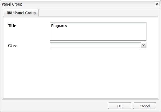
Drag the NKU Panel Group component to a drop zone, then click Edit on its toolbar. Add a title (this will appear to the user) and click OK.
An additional style is available for Panel Groups. To use it, select "nku-panel-group-w-dot" from the Class dropdown.
This only changes the look and feel; the functionality does not change.


Once the Panel Group component is on the page, it will show a drop zone. Content placed in this drop zone will only show on the page once a user has clicked to open the panel group.
You should see a blue drop zone labeled Add panel group components here.
To add content to your panel group, drag components over to it. The blue drop zone will shift down, indicating that you're adding the content to the panel group.
Text is most commonly used in Panel Groups, but any type of content can be used (images, surveys, etc.).