The NKU Slideshow component is used to display multiple images in the same location.
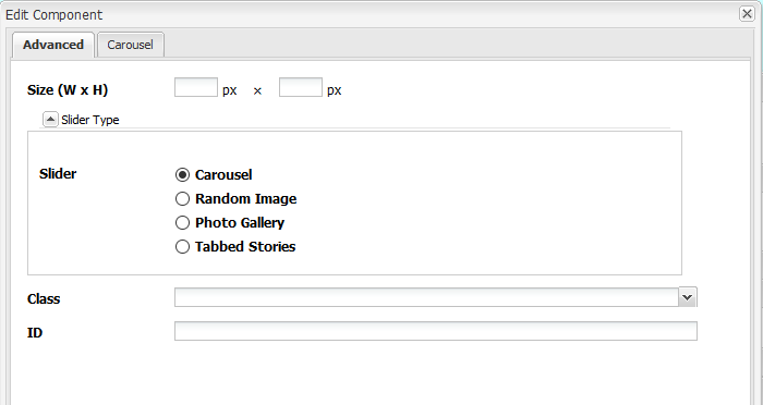
Drag the NKU Slideshow component to a drop zone, then click Edit on its toolbar to show the editor window.

Once the editor is open, you can choose what type of slideshow you wish to use, then set advanced options from the second tab.


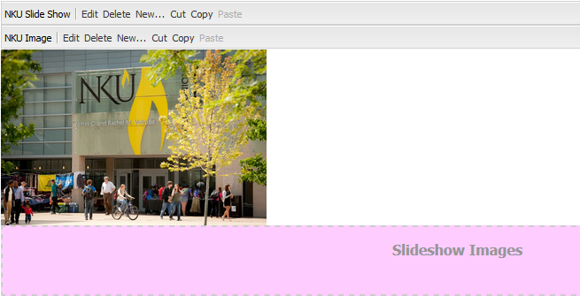
Once you've set your options for the slideshow, you will need to add images to it. The Slideshow component works as a container for image components.
To add images, drag and drop an NKU Image component into the pink Slideshow Images dropzone and edit them like you would any other image.
Once you have added all of your images, the Slideshow component will handle the display and cycling of the images based on the options you set.

The Carousel style automatically cycles through the images in the slideshow. The Carousel tab provides many options related to the slideshow.
Selecting yes on the Hide Slide Controls and Hide Bottom Pager options will prevent users from moving through your slide show at their own pace.


The Photo Gallery style will display the images in a tiled configuration.
The Image Size dropdown allows you to set one size for each image in the slideshow. All images will be either stretched or condensed to fit that size.
If the Lightbox option is checked, users can click each image, producing a pop-out effect where the image is shown in full size.

The Random Image option will display a single image, chosen at random, when the page is loaded. This is often used for banner images, which gives the page dynamic feel.
As with Photo Gallery, you have the option to set an Image Size, which will cause all the images to either stretch or shrink to conform to this constraint.

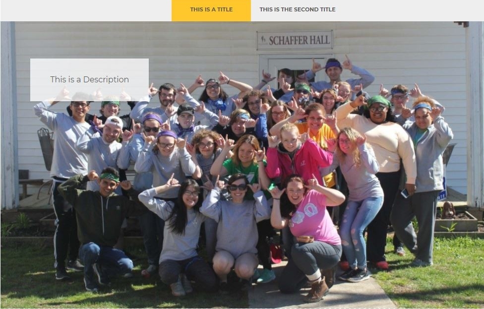
The Tabbed Stories option adds an overlay to each image, which displays the title and description for the image in a small box.
Additionally, tabs containing the title text for each image appear at the top of the component, allowing users to view different stories.
